Logo & Branding - Web Design - Brand Refresh
Our existing client Philip Nixon, a successful multi-award winning photographer, took us up on our website refresh offer and ended up with a fresh website and brand new logo!
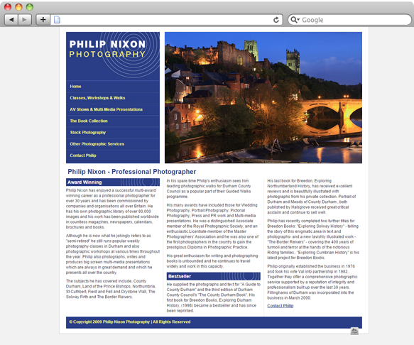
Philip's old website was originally designed by us, and although it was good at the time, it became out-dated with changes in technology.
We offered Philip a modern looking and responsive design, which could be easily updated through our content management system.
A full redesign was in order: we started from the top and redesigned Philip's logo and brand colours for a more modern look.
We created a simple lettering style logo to fit in with the feel of the site. It can be used in both horizontal and vertical formats.
HEADING FONT

BODY FONT

In order to create a clear difference between headings and body text, we chose two contrasting fonts.
We lightened the deep blue and added in a lighter blue for contrast between elements on the website.
The final colours were kept very similar to Philip's old website.
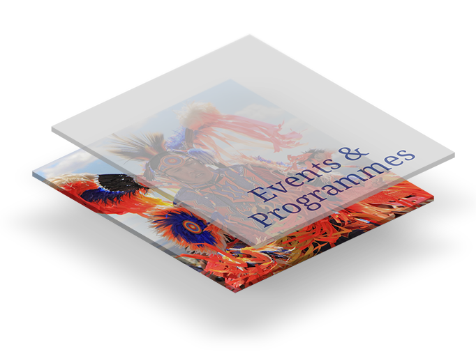
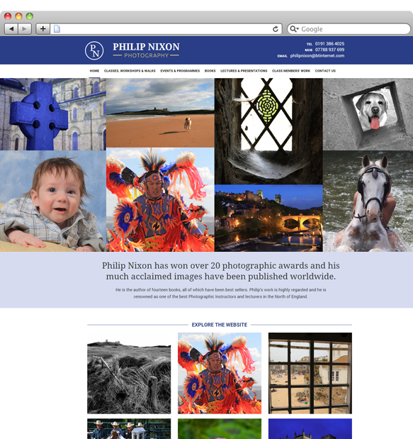
We included several interactive elements throughout the site to give an extra layer to the site and allow Philip's photographs to be viewed to their full potential.
The large image collection at the top of every page allows the user to view a number of Philip's photographs at one time - clicking on each photograph pops up a larger version for better viewing.
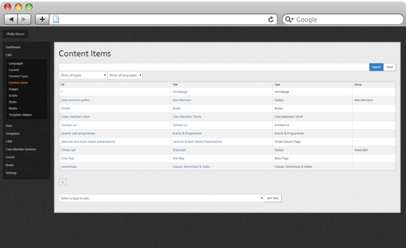
We set the site up to use our own custom content management system - Aura. This allows Philip to easily update the site content and add new images whenever he wants!
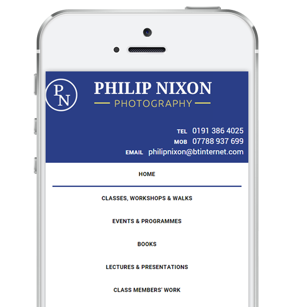
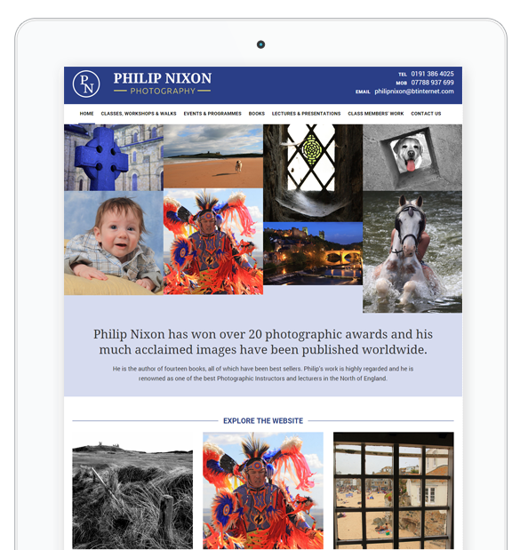
Beautiful, responsive and freshly branded. The new website
works across all devices - tablets, mobile and desktop.
It is a brilliant tool for Philip to showcase his photography.